jbristowe/r3-19-kendoreact
Telerik's 2019 KendoReact R3 release (new and updated component demo)
2019 KendoReact R3 Webinar Demo
We have some amazing new components that have hit the KendoReact site and documentation in the past quarter. Below is a quick preview of each, to dig into each one a little more, install the node modules for this project npm i and then run: npm start.
We have a separate route for each component, the entire project you are viewing is built with React Hooks and functional style components, multiple themes and responsive navigation. You can explore this project to see how we put it together and feel free to use any of this code in your projects!
Check out upcoming Webinars or Try KendoReact.
Take KendoReact for a spin with a demo of the new and updated components now!
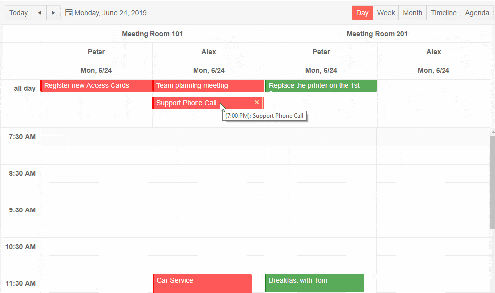
Scheduler (New)
Inspired by the rich functionality and usability of the Outlook and Google Calendars, with the new KendoReact Scheduler, you can display the day, week, month, timeline and agenda views, group items horizontally and vertically, and convert times into any time zone. The React Scheduler enables your users to insert or edit tasks either inline or via the advanced editor which allows them to add descriptions, set recurrences, associate resources and much more.
Scheduler Dependencies
npm i @progress/kendo-react-scheduler @progress/kendo-react-intl @progress/kendo-react-popup @progress/kendo-react-dialogs @progress/kendo-react-dateinputs @progress/kendo-react-dropdowns @progress/kendo-react-inputs @progress/kendo-react-buttons @progress/kendo-date-mathTreeList (New)
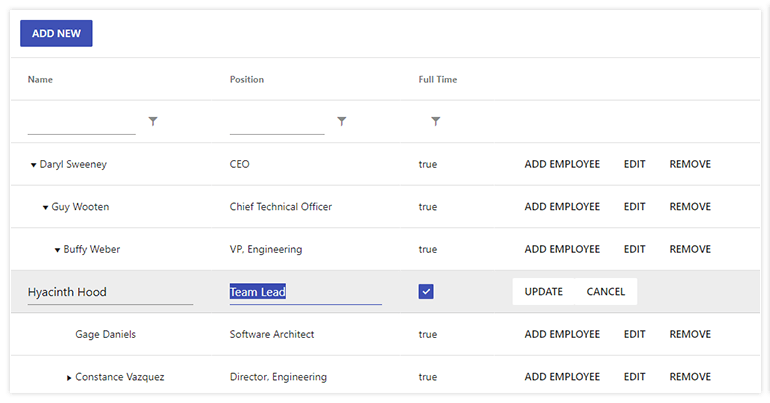
The new React TreeList component provides the hierarchical and homogeneous layout of a TreeView with the column structure of a Grid, providing a unique data layout user experience. It supports the key data operations (filtering, sorting, editing, row selection, and custom cell rendering) and globalization.
TreeList Dependencies
npm i @progress/kendo-react-treelist @progress/kendo-data-query @progress/kendo-react-inputs @progress/kendo-react-intl @progress/kendo-react-dropdowns @progress/kendo-react-dateinputsColorPicker (New)
The ColorPicker component enables users to select a color from a pre-defined palette or a gradient selection, supporting Hex, HSVA and RGBA colors. It comes with keyboard navigation and RTL support.
ColorPicker Dependencies
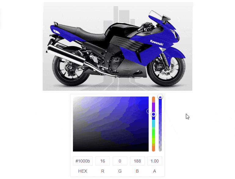
npm install --save @progress/kendo-react-inputs @progress/kendo-react-intl @progress/kendo-drawingColorGradient (New)
The ColorGradient renders a gradient, a hue, and an alpha slider, and inputs to manually enter the desired color.
ColorGradient Dependencies
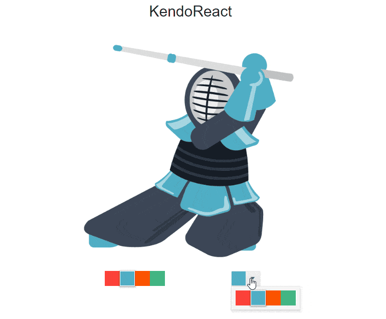
npm install --save @progress/kendo-react-inputs @progress/kendo-react-intl @progress/kendo-drawingColorPalette (New)
The ColorPalette renders colors by using sets of predefined colors (color presets) or by implementing a custom color palette.

ColorPalette Dependencies
npm install --save @progress/kendo-react-inputs @progress/kendo-react-intl @progress/kendo-drawingPager (New)
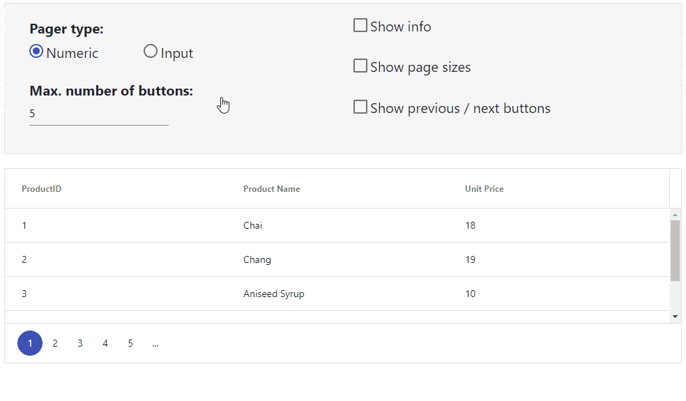
The Pager component extracts the Grid pager functionality into a standalone component, giving React developers the freedom to introduce their paging behavior in their applications. The various options it offers include numeric or input page selection, page size dropdown, previous/next buttons and summary info.
Pager Dependencies
npm install --save @progress/kendo-react-data-tools @progress/kendo-react-intlGrid (Update)
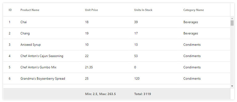
Improvements include a footer row feature, allowing for aggregates to be listed on a column-by-column basis in a common footer row. Additionally, we expanded our documentation to include many of our most frequently requested features and how they can be implemented.
Grid Dependencies
npm install --save @progress/kendo-react-grid @progress/kendo-data-query @progress/kendo-react-inputs @progress/kendo-react-intl @progress/kendo-react-dropdowns @progress/kendo-react-dateinputs @progress/kendo-drawing